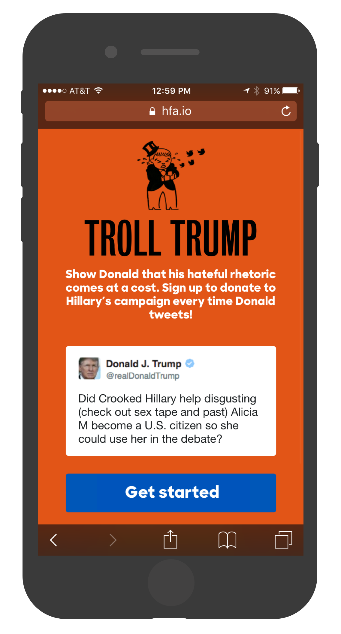
TROLL TRUMP
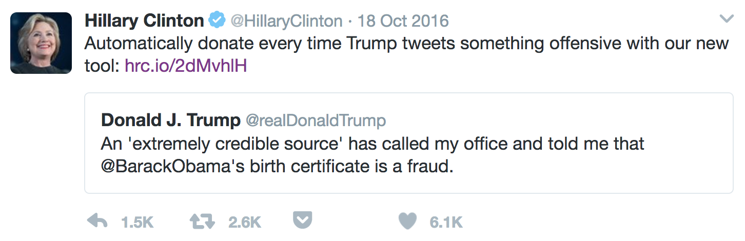
While working as a product manager on the Hillary for America tech team, I managed the design, development and public rollout of Troll Trump, a fundraising site that let users create an automatic donation to Hillary's campaign each time Trump posted on Twitter. The site raised $250,000 in three weeks.
Who's the audience?
By October on the campaign, we'd spent nearly ten months optimizing our main donation flow. About 60% of visitors to the site (and about 75% of donations) came from our email program, which blasted out compelling, moment-driven fundraising asks to our list of over 6 million. Online ads, organic traffic, and search engine referrals also drove a solid amount of traffic our way. And bringing up the rear was traffic from social media, which brought in about 5% of all visitors. Despite the overwhelming amount of election-related content posted online, few people were compelled to donate from links posted on Facebook or Twitter. To a certain extent, this is intuitive. Although HFA's social audience was roughly 15 million, compared to an email list half that size, social followers are more casual participants. The bar to follow Hillary Clinton on Twitter is a bit lower than agreeing to join an email list usually pitched as "I'm with her." Still, by the home-stretch of the campaign our fundraising team was eager to dive in to every last potentially untapped group of donors.
What to build?
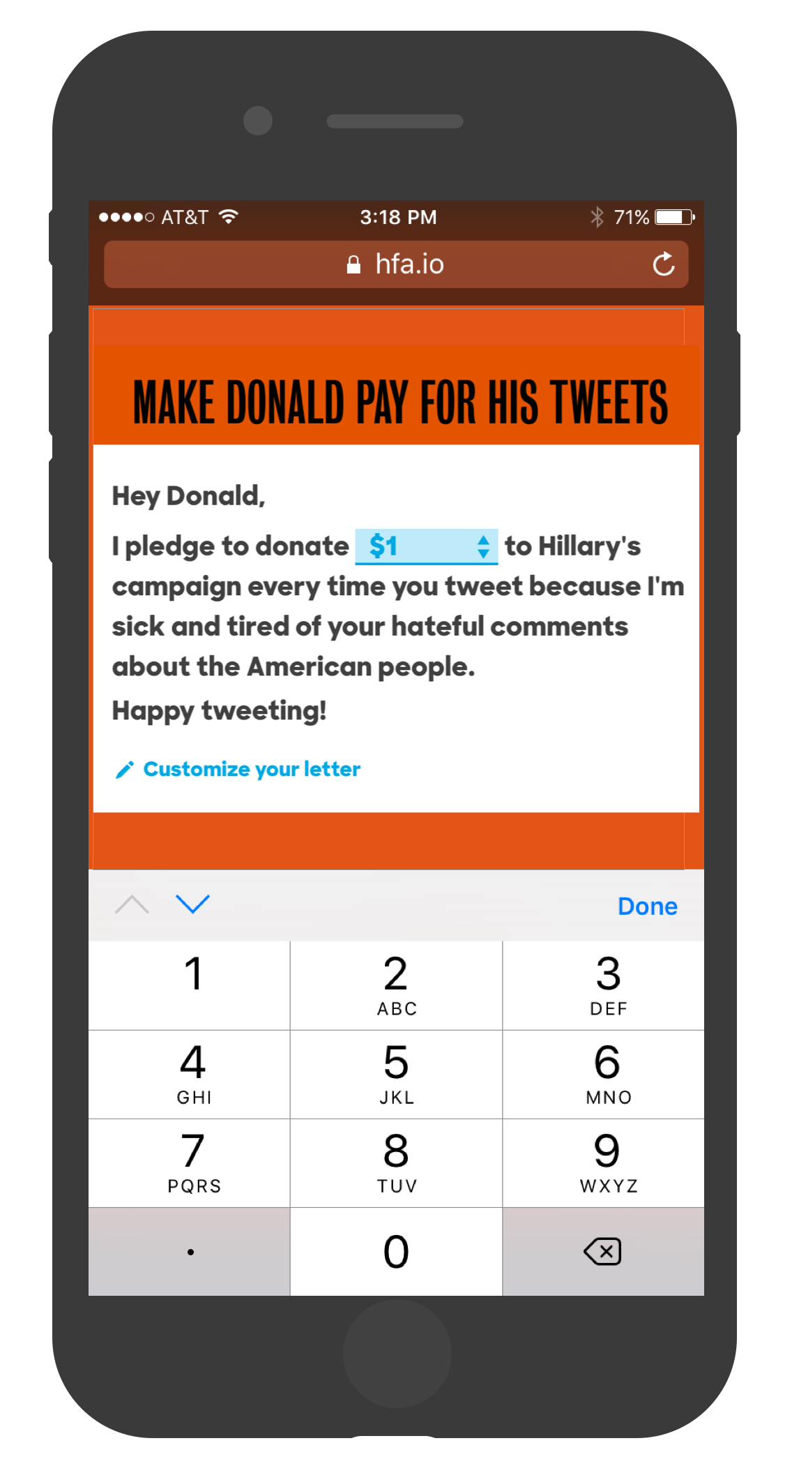
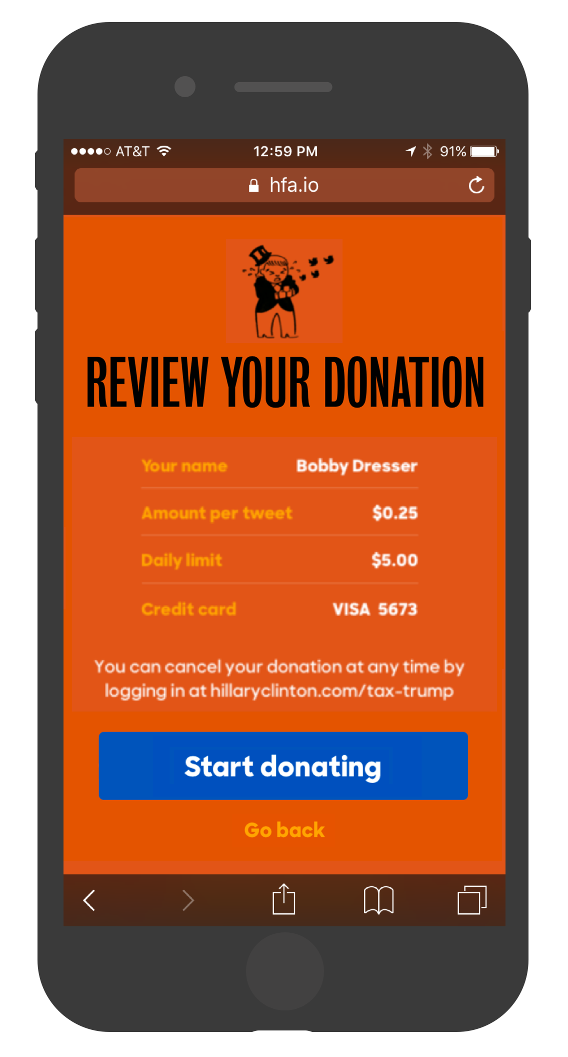
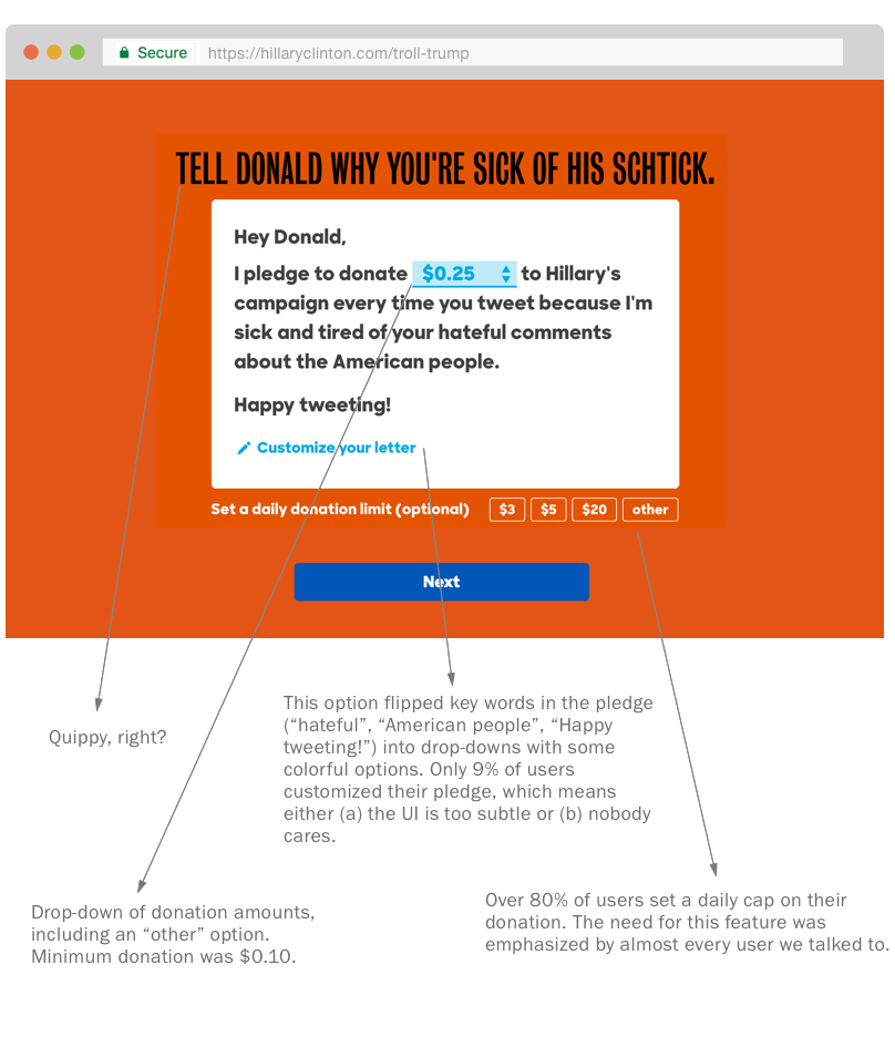
The idea for this project came, fittingly, from Twitter. We saw a number of posts over several months along the lines of "Each time Tr*mp tweets about $TOPIC, I'm going to donate to [ HFA | PP | other ]." But let's be real: that's a hard promise to follow through on. Given the size of the un-tapped social audience and the side benefit of a nice media splash, we decided to investigate. The concept was straightforward — an automatic, per-tweet donation — but what would raise the emotional stakes to make the donation compelling? And how could we build the experience to suit a tech-savvy social media audience? First, we mocked up a prototype of the core concept in InVision. Our talented design duo of Victor Ng and Aaron Lewis quickly settled on a provocative orange, and we solicited informal approval from campaign management. After a few rounds of user testing, we learned that potential users were pretty concerned with the overall money they'd spend. (Trump's tweeting habits were already notorious.) We refined the mechanics of the flow to make the optional daily donation cap a more prominent element, which anecdotally helped people get over their mental block. We also found that users who were familiar with Twitter immediately grokked the concept, but users who didn't really get Twitter (read: our strong 60y/o+ donor demographic) were generally a little confused by the presentation. To hedge, we slipped a few more explicit instructions in the landing page, but generally weren't too concerned: we were developing the product for our social audience to begin with. We designed the flow so that users set up their donation in the form of a "pledge." Users had to choose an amount to donate per tweet, and had the option to customize the text of their pledge. After checkout, the customized pledge came back to the user as a shareable image, with the hopes that users' sharing would get us a nice peer-to-peer traffic bump. More on this later.
If we build it, he will tweet
Development from start to finish took just over eight days. The frontend was built with React and Nuclear JS in a Flux architecture. Our donor universe at HFA included over million people with saved payment information, and since this audience converts at a higher rate than other users, we knew it was important to build both a first-time user flow AND a flow that let people log in to their account and checkout quickly. React components helped us replicate UI elements across these two flows while keeping the logic sound. Once a first-time user created a pledge, we asked for a password. In order to charge over the course of several weeks, we needed to tokenize their their payment information with Stripe and attach that token to a user account on hillaryclinton.com. This would also let the user return to modify or cancel their pledge by logging in to their account, which was a non-negotiable feature. Messaging for this feature was carefully tuned by our lawyers, who were on-guard after a minor story broke about folks who couldn't cancel their recurring donations to Trump's campaign. We spun up a database that tracked the user's ID, their pledge details, and the date they created their donation -- important for determining how much to actually charge. We decided to process donations once per week for a few reasons: after charging a user, we need to send an email receipt for their donation (both as a matter of good service and because our lawyers required us to). One email per week is way less bothersome that one per day.. and it's also fewer opportunities to remember to cancel a pesky recurring donation. Also, we transacted our donations through Stripe, which charges a per-auth transaction fee in addition to a low percentage. This makes it slightly more costly to process more charges.
Ship it
After squashing all the bugs, getting the app scaled in production, and after a million rounds of copy tweaks ("dangerous rhetoric" vs "unhinged rhetoric," it turns out, is a distillation of a whole campaign shift from "danger," which can be read as power, to Trump's being "unfit," which is less reverent), we waited to launch. Our stakeholders on the digital team wanted to push the site in response to the next particularly nasty tweet. We found our moment, and over the course of several days posted about five tweets and a few FB posts about the new site. Our press team did a great job of getting the story written up in a variety of publications: CNN Money, Mashable, GOOD, USNews, DailyDot, and CNet, to name a few.
How'd it do?
The site raised over $250,000 from its launch on October 20 through the election on November 8. Not chump change, but still pales in comparison to the email-driven fundraising through our main donation flow (more on that below). Still, our social channel had its best month ever in October, and we increased donations from Twitter by over 80%. At the beginning of November, the campaign made up to $2,000 for each tweet from Donald. Due to the election's timeframe, we had only a short opportunity to iterate on the product after launch. We added a smaller "donation per tweet" amount after noticing that many users entered a custom amount lower than the smallest $0.50 option. It turns out that Donald was tweeting so much per day that most users hit their "daily cap" regardless of what their per-tweet donation was. Our analytics team helped us understand that adding a smaller donation amount would encourage people to get deeper in the funnel while not depressing overall revenue. Our social share feature was also a dud. Most users came to the site from links posted by HFA social accounts, not from user sharing. Only 8% of users shared their pledges, and only about 4% of all pledges came from folks clicking on a user-generated share image they saw on social media. The development of this feature wasn't trivial, and probably wasn't worth this small bump in traffic. We should have done more user testing to get a hint at the effectiveness of this feature before committing to it in our MVP. Credit (& love) to: Victor Ng, Aaron Lewis, Nathan Kane, Vanessa Archambault, Cheston Lee, Matt Tucker, Horace Williams, Liz Zaretsky.